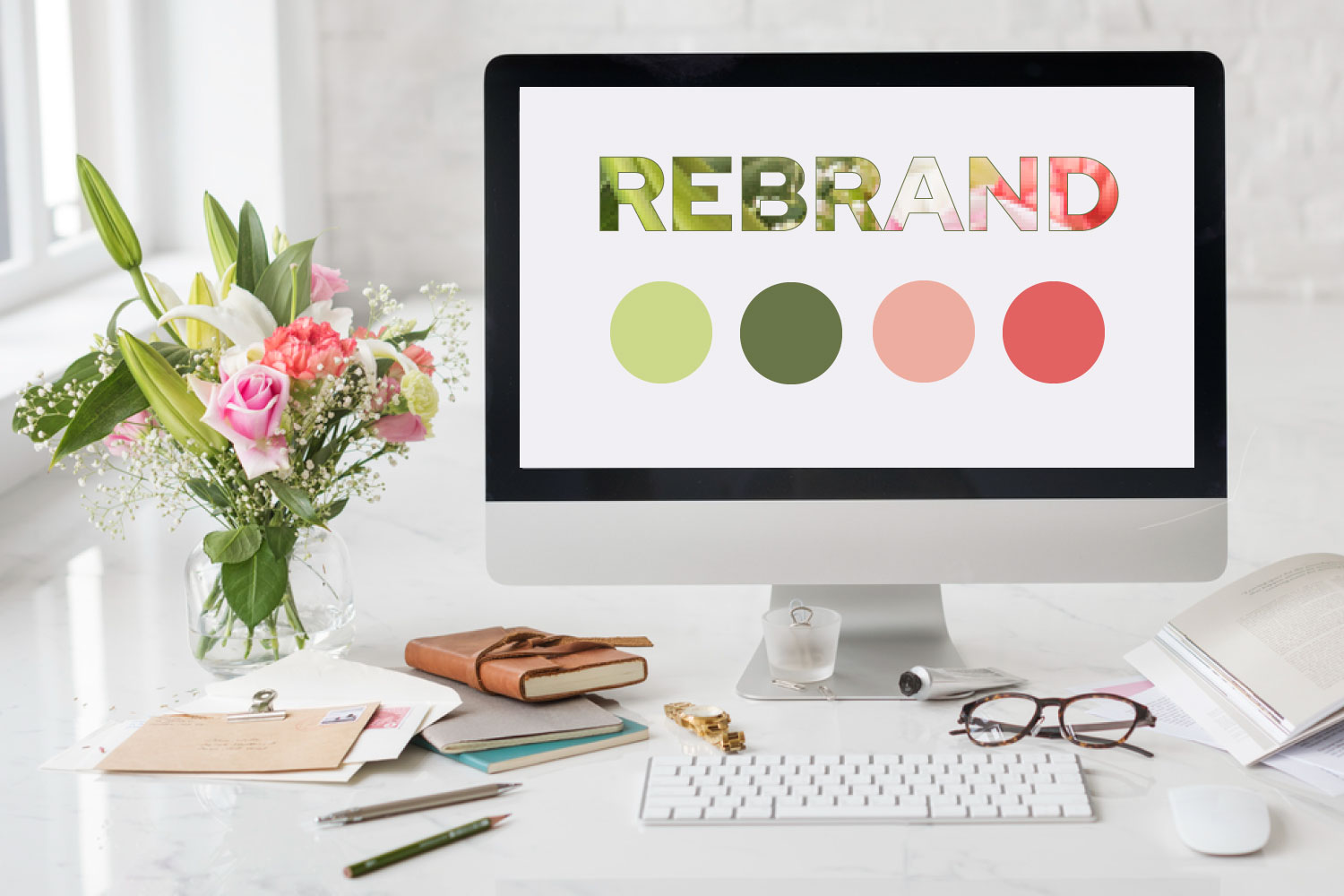
Exploring colours is one of my favourite parts of the branding process. There’s an enormous range of colours that you can explore for your colour palette and you can have lots of fun along the way! Colours help create an emotional connection with your target audience and make your brand memorable, often referred to as colour psychology.
Colour psychology refers to the emotional connection and reaction people have to colours. Research studies have proven that our responses are partly physiological, based on the effects colours have on our eyes and nervous system, and partially influenced by our environment and life experiences[1].
Let’s take a closer look at how colours can influence our subconscious and conscious reactions, appeal factor and preferences.
The Importance of Brand Colours
The psychology of colour in branding is a powerful tool that businesses can use to influence customer perceptions, emotions and behaviours. Let’s explore colour associations, the feelings they evoke and what industries they are commonly aligned with.

Red is associated with energy, excitement, passion, joy, speed, power and sometimes danger. It is vibrant and can stimulate appetite, making it a popular choice for food brands. Red is also often used for urgency and action, such as in clearance sales and call-to-action buttons. Darker reds can be considered regal and exclusive.

Blue is linked to trust, reliability, positivity and professionalism. Many financial and tech companies use blue to convey a sense of security and competence. Dark shades of blue represent integrity, loyalty, trustworthiness. Lighter shades of blue are uplifting and peaceful. Deep blue is associated with opulence.

Green is strongly associated with nature, life, growth, energy and health. It’s commonly used by brands that want to convey eco-friendliness, sustainability and freshness. Green also represents safety and traffic lights (go). It can also symbolise wealth and financial success. Darker shades represent stability and success, while pale greens are calming.
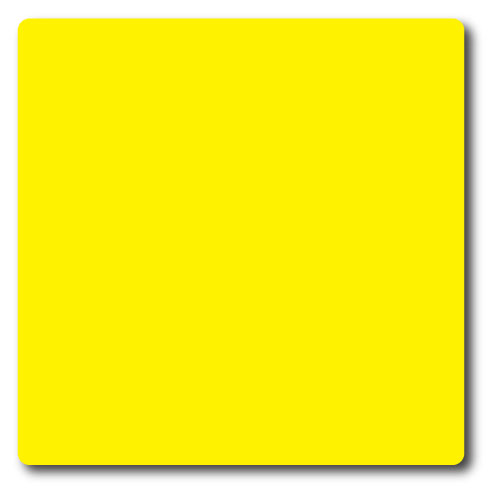
Yellow represents happiness, positivity, warmth and optimism. It commands attention and is often used to highlight important information. Yellow is known to stimulate clear thinking when paired with black text. Yellow can convey a sense of warmth and joy.

Orange combines the energy of red with the friendliness of yellow. It’s often used by brands that want to convey enthusiasm, creativity and value. Orange represents cheerfulness, adventure and fun. Bright orange offers high visibility and makes it attention grabbing.

Purple is associated with luxury, passion, power, sensuality and creativity. It’s often used by high-end brands to convey a sense of exclusivity. Deep purple can represent spirituality and mystery, while lighter shades are sweet, romantic and evoke a sense of nostalgia.

Black signifies sophistication, elegance and authority. Luxury brands often use black to create a sense of prestige. Black can also represent power and professionalism.

White represents purity, simplicity and cleanliness. It’s often used by brands that want to convey a sense of safety and neutrality. White cam also be associated with minimalism and modernity.

Brown is linked to earthiness, reliability and stability. It’s commonly used by brands in the outdoor, agricultural and food industries. It can create a sense of warmth, comfort, reliability and sincerity. Brown can also appeal to those who favour neutral colours and natural products.
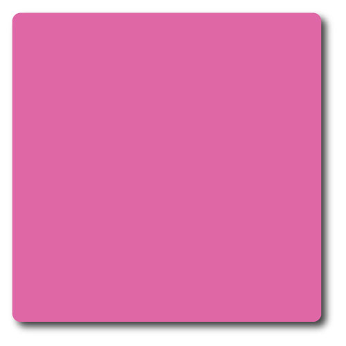
Pink is associated with femininity, romance, sweetness, nurturing and compassion. It’s often used in products and brands targeted at a female audience. Lighter shades of pink can convey a sense of innocence, while brighter shades are energetic, fun and trendy.

Grey represents neutrality, balance and professionalism. It’s often used as a background colour in branding to highlight other colours and elements. Grey can also convey a sense of maturity, seriousness, wisdom and authority. If using metallic grey it can represent science, technology, speed and competence.
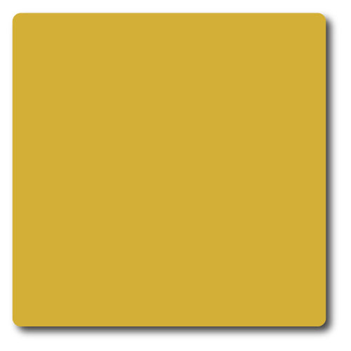
Gold is associated with luxury, wealth and success. It’s often used by high-end brands to convey opulence and exclusivity. Gold can create a sense of prestige and elegance.
Importantly, there are many shades and hues of each colour that can change the emotion a feeling evokes. For example, dark blue has a regal association while light blue can be uplifting and peaceful.
Lastly it’s important to note, these are generalised colour descriptors. Associations with colours can differ for individuals based on experiences, cultures and environments.
Choosing Brand Colours
Generally, when it comes to selecting your brand colours and palette there are no hard rules. It comes down to your personal preferences, your vision and what you want your business to represent. You can also read my article, A Guide to Branding which takes you through the complete branding process.
If you are exploring colour schemes and palettes for your brand, I recommend you take a look at Pantone Colour Palettes or Canva Colour Palette Generator. These websites provide lots of inspiration and ideas on how colours work together to enhance your brand.
We recommend working with a brand designer or brand specialist to help you create a professional design. They will provide a range of concepts and insights into branding, design and colour selections that align with your business and vision. Your brand is an investment in and becomes a valuable business asset over time.
Need Professional Support?
Through our Impact Branding Package we offer a complete service to help establish your new business. We work closely with you to understand your business, your offering, your values, your customers. Other aspects that inform our creative branding process are your aspirations and goals. All these elements will form the basis of your brand identity, meet your goals and more importantly connect with your target audience.
[1] Colour Harmony Compendium,2009

